
目次
サイドバーとは
WEBサイトの左右に配置されたゾーンで、ここに「検索」や「お問合せ」や「広告」や「ナビゲーション」などを配置する事で情報を探しやすくなる便利なゾーン。
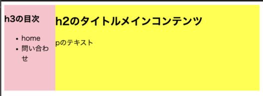
仕上がりの完成図
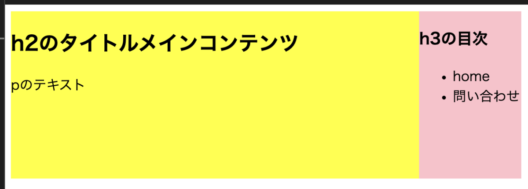
左側にサイドバー
 にゃんこ1
にゃんこ1箱を置くレイアウトをイメージして作っていくニャン
 にゃんこ2
にゃんこ2今回高さ200pxで作ってみたにゃ。
共通のHTML記述
<!DOCTYPE html>
<html lang="ja">
  <head>
    <meta charset="UTF-8">
    <link rel="stylesheet" href="style.css">
    <title>タイトル</title>
  </head>
  <body>
    <div class="container">
      <div class="side">
        <h3>h3の目次</h3>
        <ul>
          <li>home</li>
          <li>問い合わせ</li>
        </ul>
      </div>
      <div class="body">
        <h2>h2のタイトルメインコンテンツ</h2>
        <p>pのテキスト</p>
      </div>
    </div>
  </body>
</html>
%で指示をする
CSS
 .container {
    width: 100%;
    height: 200px;
    display: flex;
  }
  .body {
    width: 80%;
    background-color: yellow;
  }
  .side {
    width: 20%;
    background-color: pink;
  }
右側サイドバーにする
flex-direction: row-reverseを追記するだけ
CSS
 .container {
    width: 100%;
    height: 200px;
    display: flex;
    flex-direction: row-reverse;
  }
  .body {
    width: 80%;
    background-color: yellow;
  }
  .side {
    width: 20%;
    background-color: pink;
  }
1:2の比率になるように割り当てるCSS
サイドバーが1、本文が2の比率になるように割り当てる方法
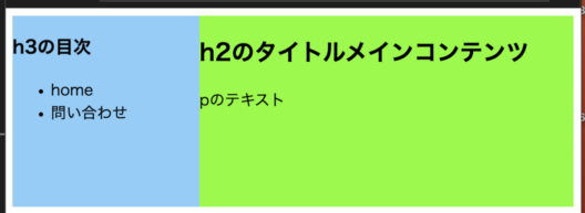
CSS
 .container {
    width: 100%;
    height: 200px;
    display: flex;
  }
  .body {
    flex: 2;
    background-color: lawngreen;
  }
  .side {
    flex: 1;
    background-color: lightskyblue;
  }
flex+数字の復習はこちらをみてね ▼
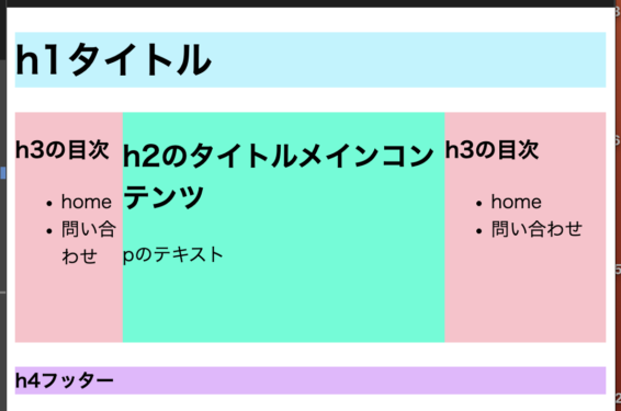
応用編 1
両端サイドバーとhederとfooterをつける
HTML
<!DOCTYPE html>
<html lang="ja">
  <head>
    <meta charset="UTF-8">
    <link rel="stylesheet" href="style.css">
    <title>タイトル</title>
  </head>
  <body>
    <header>
        <h1>h1タイトル</h1>
    </header>
    <div class="container">
      <div class="side">
        <h3>h3の目次</h3>
        <ul>
          <li>home</li>
          <li>問い合わせ</li>
        </ul>
      </div>
      <div class="body">
        <h2>h2のタイトルメインコンテンツ</h2>
        <p>pのテキスト</p>
      </div>
      <div class="leftside">
        <h3>h3の目次</h3>
        <ul>
          <li>home</li>
          <li>問い合わせ</li>
        </ul>
      </div>
    </div>
    <footer>
        <h4>h4フッター</h4>
    </footer>
  </body>
</html>
CSS
.container {
    width: 100%;
    height: 200px;
    display: flex;
    flex-direction: row-reverse;
  }
  .body {
    width: 50%;
    background-color: rgb(0, 255, 213);
  }
  .side {
    width: 30%;
    background-color: pink;
  }
  .leftside {
    width: 20%;
    background-color: pink;
  }
  h1{
    background-color: rgb(182, 245, 255);
  }
  h4{
    background-color: rgb(231, 182, 255);
  }
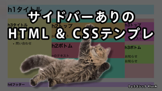
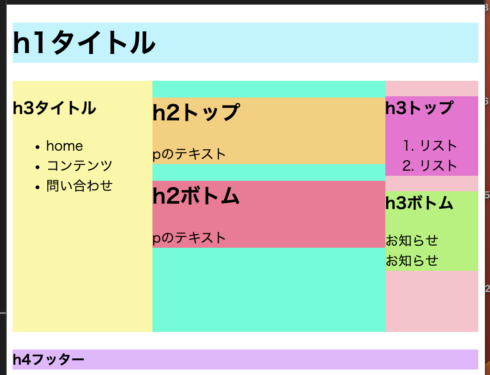
応用編 2
さらに細かく分けるレイアウト
メインコンテンツやサイドバーの中にコンテンツを入れていく
コンテンツに合わせて横幅はのびる仕様
HTML
<!DOCTYPE html>
<html lang="ja">
  <head>
    <meta charset="UTF-8">
    <link rel="stylesheet" href="style.css">
    <title>タイトル</title>
  </head>
  <body>
    <header>
        <h1>h1タイトル</h1>
    </header>
    <div class="container">
      <div class="side">
        <div class="topside">
        <h3>h3トップ</h3>
        <ol>
          <li>リスト</li>
          <li>リスト</li>
        </ol>
    </div>
    <div class="bottomside">
        <h3>h3ボトム</h3>
        <p>
          お知らせ<br>お知らせ
        </p>
    </div>
      </div>
      <div class="body">
        <div class="topcontent">
            <h2>h2トップ</h2>
            <p>pのテキスト</p>
          </div>
          <div class="bottomcontent">
        <h2>h2ボトム</h2>
        <p>pのテキスト</p>
    </div>
      </div>
      <div class="leftside">
        <h3>h3タイトル</h3>
        <ul>
          <li>home</li>
          <li>コンテンツ</li>
          <li>問い合わせ</li>
        </ul>
      </div>
    </div>
    <footer>
        <h4>h4フッター</h4>
    </footer>
  </body>
</html>
CSS
.container {
    width: 100%;
    height: 300px;
    display: flex;
    flex-direction: row-reverse;
  }
  .body {
    width: 50%;
    background-color: rgb(0, 255, 213);
  }
  .topcontent {
    background-color: rgb(250, 206, 116);
  }
  .bottomcontent {
    background-color: rgb(250, 116, 149);
  }
  .side {
    width: 20%;
    background-color: pink;
  }
  .topside{
    background-color: rgb(243, 111, 212);
  }
  .bottomside{
    background-color: rgb(168, 243, 111);
  }
  .leftside {
    width: 30%;
    background-color: rgb(251, 247, 161);
  }
  h1{
    background-color: rgb(182, 245, 255);
  }
  h4{
    background-color: rgb(231, 182, 255);
  }